Peel Card
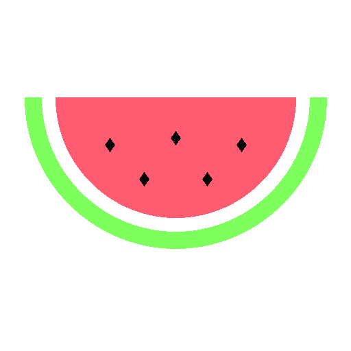
Card front retracts on hover revealing vibrant content underneath.
Component Showcase
Interactive Playground
Adjust sliders and values to preview changes in real-time
width
The width of the peel card.
height
The height of the peel card.
peelTitle
The title shown on the front peel layer. Set this prop to your own title text.
peelCategory
The small category text on the front layer.
peelHint
The helper text on the front layer.
revealTitle
The title revealed underneath the peel.
revealDesc
The description text revealed underneath the peel.
API Reference (Props)
Component properties and type specifications
| Prop | Type | Default | Description |
|---|---|---|---|
| width | string | number | 288 | The width of the peel card. |
| height | string | number | 208 | The height of the peel card. |
| peelTitle | string | "Rind Peel Card" | The title shown on the front peel layer. Set this prop to your own title text. |
| peelCategory | string | "Component" | The small category text on the front layer. |
| peelHint | string | "Hover to reveal" | The helper text on the front layer. |
| revealTitle | string | "Fresh 🍉" | The title revealed underneath the peel. |
| revealDesc | string | "Underneath the rind, something juicy." | The description text revealed underneath the peel. |